Mobile App Design
The Design Museum of Chicago ( formerly known as the Chicago design museum or ChiDM), was looking for ways to get new audiences to interact with the museum’s Great Ideas of Humanity Exhibit. I worked with 2 other UX designers to create a product that best engages the community with the museum. Chicago youth is core to the museum’s mission so we decided to research and develop a prototype that would better engage teens with the museum exhibit. We developed ChiSnap— a mobile app that seamlessly connects users to the contextual information and human stories behind every piece of art while not taking away from the viewing experience.
Client: Design Museum Chicago
Role: UX Designer and Researcher
Tools: Sketch, Axure, InVision
Timeframe: 4 weeks


1.Understanding the problem
The Chicago Design Museum wanted to create a digital product that facilitates engagement between visitors and the Great Ideas of Humanity exhibit. My background in museum exhibition design really came in handy for this project. I have worked with museums first hand on planning and experimenting with new ways to better understand and attract younger demographics to make them feel included and seen in the art world. Digital art museums, popup experiences, social media, mobile applications, and other interactive digital elements are being used to garner more interest and increase visitor engagement.
Participatory and interactive tools are enjoyed by all museum attendees but are more often developed to engage, educate, and entertain young visitors. So far, these tools have mostly been within the exhibition themselves or as mobile tools meant to be used in the exhibit. Our first assumption was that there may be an opportunity to develop something that affords users the capacity to interact with an exhibit remotely or to engage a more personal relationship with artists to have a better understanding of the artworks.
We spoke with the client to address our assumptions and to keep our project goals aligned.
2. Interviews
SME interviews were conducted with the Museum Director and the Director of Exhibitions in order to identify target user groups and to have a better understanding of the museum’s mission. After we outlined our research goals in a detailed research plan, we were able to streamline specific questions to stay within the scope of our research goals.

User interviews were completed by talking with High school students and rising college freshman that live within accessible distance to the Design Museum of Chicago. The SMEs mentioned a variety of target user groups they wanted to cater to so that the museum could be an inclusive and collaborative environment that is beneficial to a diverse community. We decided to focus on the mission statement of the museum in order to narrow down the user groups. Chicago youth is core to the foundation of the museum and therefore, we felt like that would be the best user group, to begin with. I created a user interview plan and outline along with a script of specific questions for each user. The main goal of the interview was to identify how the users felt about museums, great design, great ideas, and their digital habits so that we can define the best user engagement practices for our product solution.


3. Understanding Competitors
Competitive Analysis

Digital platforms such as Dribbble and Behance are great places for creatives to connect and share their work. They do however exclude the younger demographic who are not professional creatives but are just looking for some different perspectives and guidance for their own creative work. Those platforms are an intimidating and somewhat competitive environment for inexperienced creatives to feel comfortable joining the conversation.
Traditional museums such as the Museum of Contemporary Art and the Museum of Arts and Design make an effort to teach their patrons about art through workshops sometimes taught by artists. These workshops are centered around creating some sort of art leaving not much time for asking general questions a young person might have for an artist. If someone goes to the museum just to look at an exhibit, there is usually not much context about the art to help the museum patron understand the narrative behind it.
In the marketplace, there exists space for giving young people more access to artists and a place to feel comfortable connecting with them and asking questions to better understand their art.
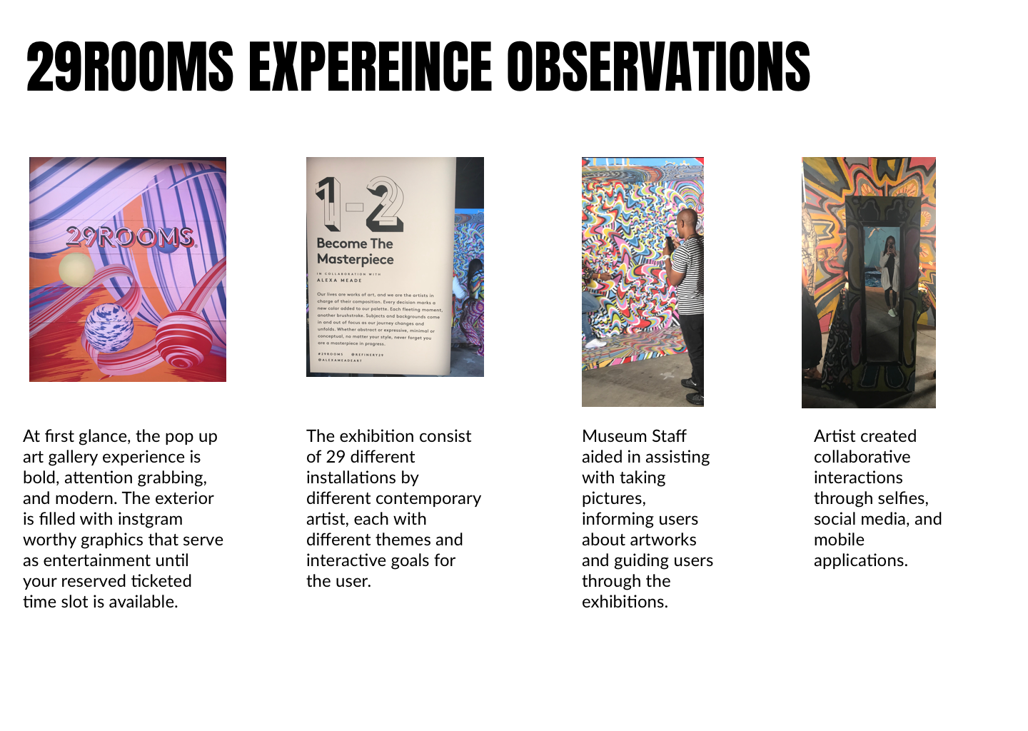
Field Study
To get a better understanding of our competitors I went to the 29Rooms popup art experience to observe how similar museum models are currently interacting with teens. I spoke with a high school student from Chicago that was visiting 29Rooms and two things that stuck out to me was that she took a lot of pictures with her phone but did not want to use social media until after. I realized posting to social media requires more work than taking a picture ( selecting, editing, sharing options, captions, location, and posting) which could distract from the expereince, while the action of taking a photo can be part of the experience.

4. Understanding Our User
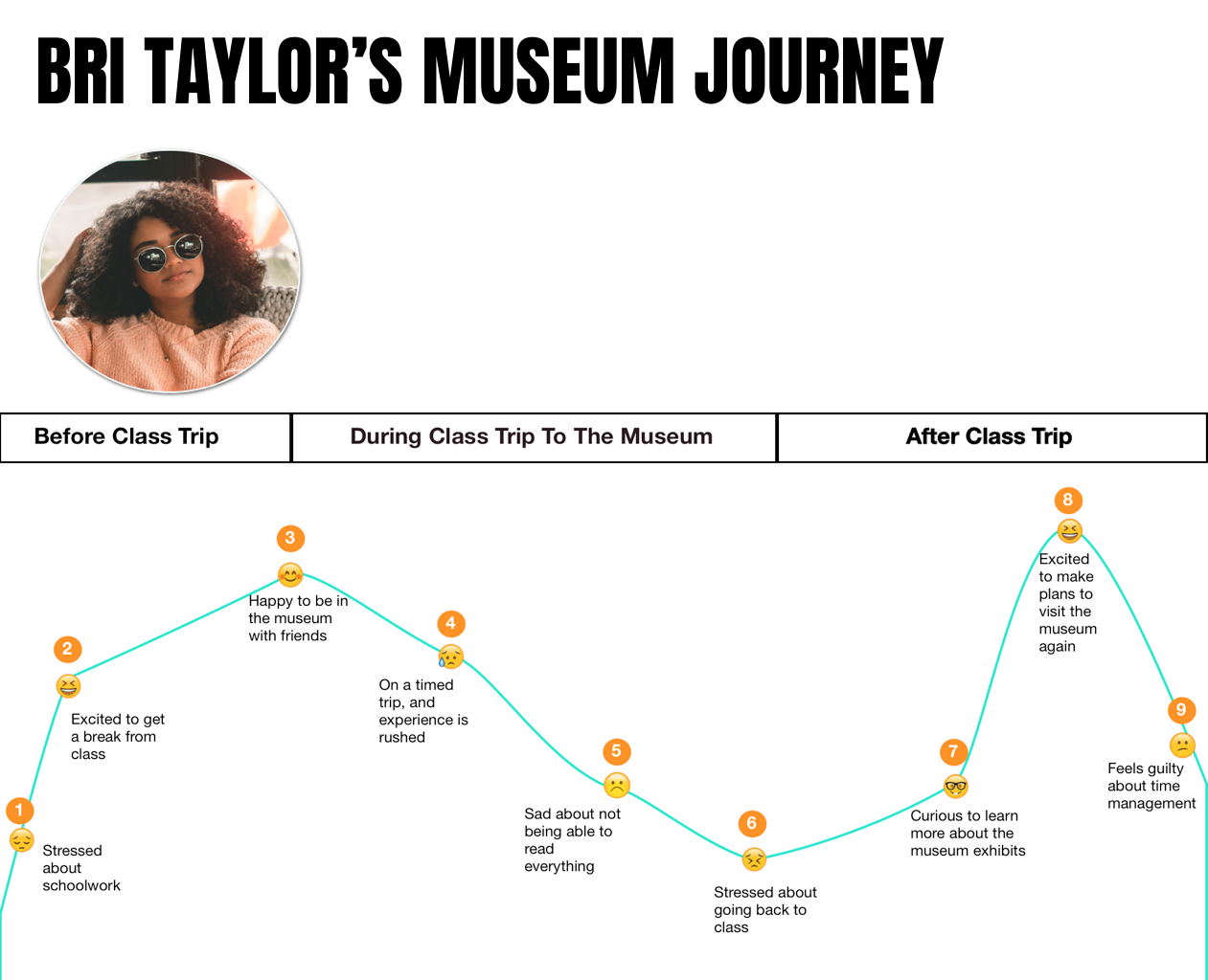
After analyzing the research data, we concluded that teens want guidance and mentorship to help organize their busy lives and reduce stress. Our data was pushing us in the direction of figuring out a way to use the museum to connect Chicago youth directly with the artist and encourage guidance and mentorship. Being concerned about feasibility, privacy concerns, and protecting minors I pushed for us to focus less on physical human interactions and more on digital engagement through human elements. We needed to understand how teens would want to connect digitally to artists and artworks. First, we created a persona to better define our target user, then we developed a user journey and emotional experience map so we could identify the problem and create design principles to keep design solutions aligned.
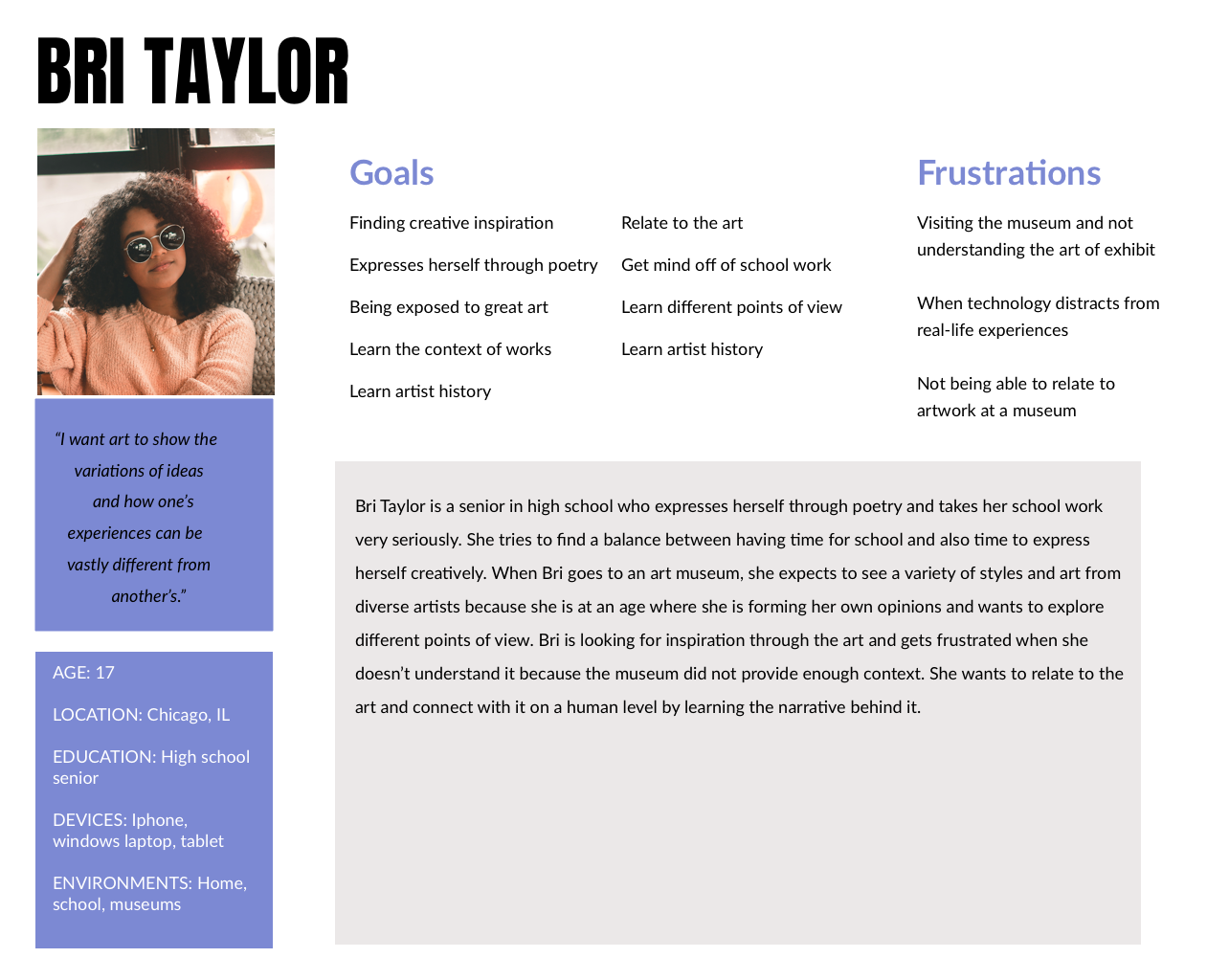
Problem statement:
Inquisitive and time-strapped high school students need context for what they see at the museum so that they can draw parallels between the museum and their own lives. Without context, teenagers are unable to relate the art to their own experiences, leaving them feeling confused, frustrated, and excluded.
Design Principles:
Keep it informal- Create a comfortable digital environment for teenagers to ask professional artists and designers questions.
Humanize the experience- The user is young, busy and has a short attention span. Emphasizing stories of people and process engages the user and helps them to relate.
Enhance, don’t distract- Enhance the museum experience without taking the focus away from the goals of the user and the exhibit.
5. Concepting Soultions
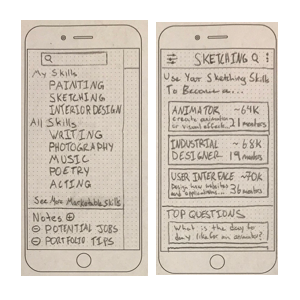
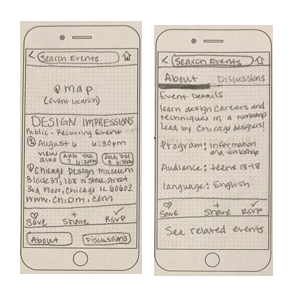
We developed and tested paper concepts and mid-fidelity prototypes. We needed to test ways a digital platform that would give more context and could provide guidance and mentorship to teens while keeping in mind financial constraints and COPPA laws. We created 3 concepts to test with users and observe effective interactions to converge into a final product. We began by testing paper prototypes of different interactions, made iterations based on test feedback, then created low fidelity mockups with InVision. We then tested the divergent concepts and based on the test feedback we developed our final product solution.
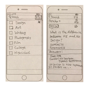
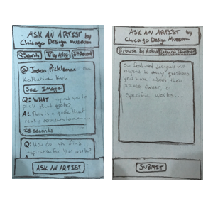
Paper prototypes
Browse- browse careers by interest
Events- event listing for visitors
Forum- question and answer between users and select artist
Divergent Concepts
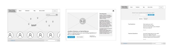
Artist map-A website that lets museum visitors learn more about local artists’ lives and stories.
Artist timeline-A digital product that aggregates an artist’s work and shows their progress over time to contextualize the art.
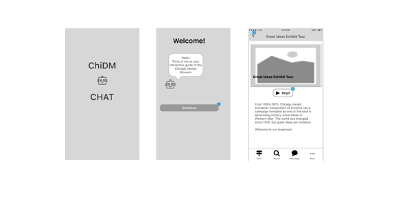
Guided tours- An app providing a mobile digital guided tour experience with more information that enhances your visit.
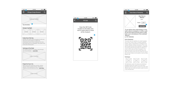
We used the results from the concept test to converge the divergent concepts into one final prototype. The users we tested wanted a quick, seamless, informational experience. Inspired by the IKEA product finder and the Hirshhorn eye mobile app, we developed a mobile application concept that gives the user a quick immersive experience into the exhibition without compromising the museum's goal of letting the art speak for itself.
We also completed annotated wireframes for ui designers to use moving forward for the production of the app. We kept in mind ui, developers, and stakeholders when annotating.
Full annotated wireframes can be viewed here.
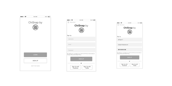
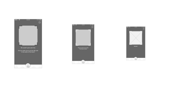
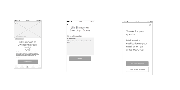
ChiSnap
a mobile app that seamlessly connects users to the contextual information and human stories behind every piece of art while not taking away from the viewing experience.